The fundraising landscape has changed many times over the years, especially as technology has advanced. In the internet age, it’s no surprise that online fundraising has become an integral part of every nonprofit’s fundraising strategy, and it all starts with your online donation form.
A well-designed donation form has a larger impact on the success of your online fundraising strategy than you may think. It takes 50 milliseconds to make a good first impression on website users, and donors are 34 percent more likely to give on responsive websites. Essentially, if your donation form is generic or clunky, you may be driving away potential donors.
If you’re not sure where to start when it comes to designing your first online donation form, here’s a list of tips to help you make the most of the real estate on your donation form and optimize the online giving process so you raise more for your cause.
Keep it Simple
When it comes to your online donation form, getting your donors from the first click to the final “Donate Now” button quickly and efficiently should be one of your top priorities. If your donors need to scroll endlessly and fill out multiple pages packed with fields to donate to your organization, it’s easy for them to give up during the process. It’s best to keep your donation form to one page of basic information to fill out.
If you want to collect more information, consider using a multi-step form layout to break the process down into a few short steps. Consider using custom and conditional fields to ensure that certain questions only show for the people that need to see them. Custom fields will keep your donation form streamlined and uncluttered, making for a better user experience for all of your donors.
Brand your Donation Form
When someone encounters your donation form for the first time, they should be able to immediately recognize that it’s your organization’s donation form. The best way to ensure your donation form is recognizable is by adding your organization’s branding. Try to use the fonts and colors you use on your website for your donation form, and prominently feature your logo on your form as well.
Not only does branding your donation form make your form more recognizable, but it can also help you bring in more donations. Studies show that donations made on a branded donation form are, on average, 38% larger than contributions made through a generic PayPal page, and supporters are nearly 70% more likely to give a second donation if they used a branded page the first time they made a contribution.
Make it Mobile-Optimized
In a world that’s constantly on the go, accessing the internet on smartphones is quickly becoming the norm for people everywhere. In fact, 51% of people who visit a nonprofit’s website do so on a mobile device. If the urge to donate strikes but your busy donors don’t have access to their laptops or personal computers, you want to make sure they can still donate from their phones. Mobile-optimizing your donation form can help make that happen. To ensure your form can be easily navigated via smartphone, keep your donation webpage simple, make sure that buttons and text are at a comfortable size so they can be easily read on any screen, and keep your layout vertical, not horizontal.
Add Recurring Donation Prompts
Passionate donors to your organization often want to know how they can go above and beyond to show their support for your mission, and one of the best ways they can do so is with recurring gifts. Make it easy for donors to make even more of an impact with their donation by adding recurring donation prompts to your online donation form.
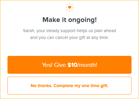
With Qgiv’s donation forms, you can choose between two different recurring donation prompts—a recurring upgrade nudge and a recurring upgrade modal. A nudge is a small, static element that appears on your donation form and gives donors a way to upgrade their gift without interrupting the process of making a donation.

If you want donors to seriously consider a recurring gift, adding an upgrade modal will cause a pop-up to appear at the end of the donation process and ask donors to either upgrade their donation or dismiss the window before completing their donation.

Show, Don’t Just Tell
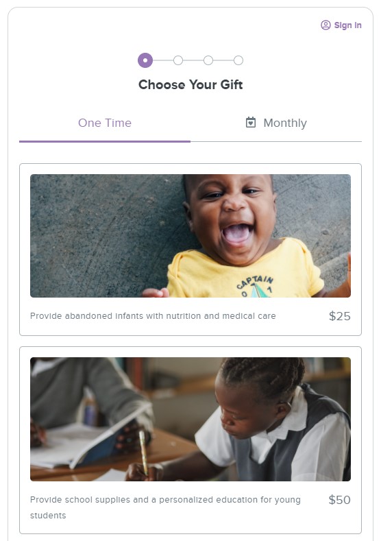
Help your donors see the impact of their gift by adding pictures to your donation form. Try to add images relevant to your organization like action photos of your volunteers or pictures of a community your nonprofit has made a positive impact on in the past. For added effectiveness, consider adding photos to your pre-determined donation amounts so donors can see how their specific gift amounts can make a difference to your organization and the communities you serve.

Incorporate a Matching Gifts Tool
Matching gifts are often an underutilized source of donations for many nonprofits. Surveys show that 84% of people are more likely to donate if a match is offered, and a third of donors say they would give a larger gift if their donation was being matched. Don’t let this fundraising opportunity go to waste! Adding a matching gifts tool from organizations like Double the Donation and HEPdata makes it easy for donors to search and see if their company has a matching gift program without having to navigate away from your online donation form
Don’t Forget a Thank-You Page and Receipts
Once your donor has completed their donation, don’t forget to thank them for their generous gift. Design a thoughtful thank-you page and send a receipt to your donor’s email to confirm that you received their gift. In addition to the important details, use this opportunity to encourage your supporters to stay connected by including social media buttons and additional information about how they can get involved. Add photos and impact statements so your donors know exactly how their donation is making a difference.
Final Thoughts
Designing your first online donation form is extremely important to the success of your online fundraising strategy. If you’re looking for more resources to create a well-designed donation form, check out these links for more tips and best practices.


